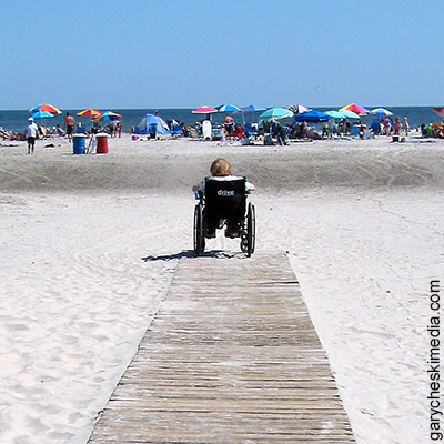
The information super highway is open for everyone to travel but the journey for people who are disabled all too often ends in reaching an exit ramp and finding it closed. Making your website accessible usually requires minimal time and effort, and not only expands your audience to visitors with disabilities, but also benefits everyone.
The Internet has been a godsend to people who have a disability by providing access to information that was impossible in the past. However, too many of us create websites, post to blogs, and upload videos without ensuring they are accessible to all site visitors. Before learning how to make your site accessible, it helps to first understand the obstacles to accessing the Internet that different disabilities present and the assistive technologies that are used to overcome them.
Disabilities and challenges
Hearing
Challenges: Cannot hear sound from video and audio content.
Assistive Technologies Used
- Captions
- Transcripts
Visual
Challenges: Dependent on type and severity of disability. Some people simply cannot read small text. The blind are unable to see any visual content. People who are color blind cannot distinguish between elements differing in color alone.
Assistive Technologies Used
- Screen-reader, which translates the text of a web page into speech or Braille.
- Web browser that can enlarge text
- Screen magnifier software
Motor
Challenges: Extreme difficulty or inability to use a mouse. The user must rely on some form of keyboard navigation.
Assistive Technologies Used
- Mouth stick, which is a stick held in the mouth and used to type on a keyboard.
- Voice recognition software
- Sip and puff switch
- Oversized trackball mouse
I can think of no better way to comprehend the struggles with web accessibility that people with various disabilities face, than listening to them describe their experiences as featured in the following two videos from WebAIM:
Keeping Web Accessibility in Mind (Closed Captioned)
Experiences of Students with Disabilities (Closed Captioned)
Steps for making your website accessible
You don’t need to be a web design expert to make your site more accessible. The process results in pages that are well-designed, more user friendly, work better on mobile devices, and rank higher by search engines. Some of the steps that you or your web designer can easily implement are:
- Caption or provide transcripts for video and audio content.
Create transcripts with a word processor or text editor. YouTube provides instructions on how to use transcripts or caption files. A transcript contains only the text of what is said in the video, which will be automatically synchronized by YouTube. A caption file includes the time codes for when each line of text should be displayed. Special software also exists to create and add captions directly into your video file, including free programs such as Subtitle Workshop (Windows) and Aegisub (Windows/Mac/Linux). An added benefit of including a transcript with your YouTube video is that it will be indexed and searchable in Google. Make sure you let your audience know that your content includes captions or a transcript.
- Provide alternative text for important non-text content.
Use your web design software or blogging interface to type in alternative text for all important images and graphics so that it can be read by a screen reader. Avoid including alternative text for graphics that are purely decorative.
- Use headers.
Including headers in your content provides structure and levels of hierarchy. Screen readers can navigate from header to header and create a summary of a page based on headers. Be sure to use headers in the proper order, h1, h2, h3, etc.
- Do not use graphics to represent text when plain text is suitable.
A browser is capable of enlarging plain text and making it readable. Graphical text, when enlarged, might become blurry and unreadable.
- Do not use unnecessarily small text.
Keep text in a size that is easily readable. Although text can be enlarged with software, do not assume that everyone knows how to do so.
- Use punctuation.
Punctuation enables voice synthesizers to use correct cadences and produce more understandable speech.
- Use descriptive link names rather than “click here.”
Screen readers often create a list of links on a page, consisting only of the link text. Without any context, link names such as “click here” are meaningless.
- Use enough contrast between text and backgrounds so the text stands out and is readable.
- Do not use color alone to convey information.
- Use an online tool to test your website’s accessibility.
The tools produce reports that can help you identify problems with your web page’s accessibility. Much of the information could be difficult to understand for those not familiar with HTML and web design but, nevertheless, still worth a look for everyone. There are several online tools listed in the Resources below.
I have covered only the basics on how to make your website more accessible. For more in depth, technical information, check out the Resources links listed at the end of this posting.
I hope you are motivated to address web accessibility in your current and future websites and blogs. Doing so will not only open those exit ramps on the information super highway to people who are disabled but also improves travel for everyone. Please feel free to post your comments about your experiences.

Resources
- WebAIM: Intro to Web Accessibility in Mind
- World Wide Web Consortium (W3C): Introduction to Web Accessibility
- 4 Ways to Make Your WordPress Site More Accessible
- Tips: Design for accessible Web sites (from Internet Archive)
- Create Accessible PDF Files for People with Disabilities
- WAVE Web Accessiblity Tool
- IDI Web Accessibility Checker
- W3C: Complete List of Web Accessiblity Evaluation Tools
- Easy Checks – add-ons for Firefox and Internet Explorer
- Subtitle Workshop (Windows)
- Aegisub (Windows/Mac/Linux)


