You don’t need to be an accessibility expert to make sure that your content is accessible. There presently are no government standards for web accessibility. However, the World Wide Web Consortium has published Web Content Accessibility Guidelines (WCAG), the latest being WCAG 2.1. The WCAG contains guidelines for how websites can be developed to be accessible for people with disabilities. Your institution might have drafted its own set of accessibility requirements for online courses and web content, and quite possibly adopted some of the WCAG. I would strongly advise taking the time to at read through WCAG 2.1. WCAG 2.2 will be finalized soon.
Let’s start with web content that is viewed within a browser, and how to make it accessible.
Add alternative text
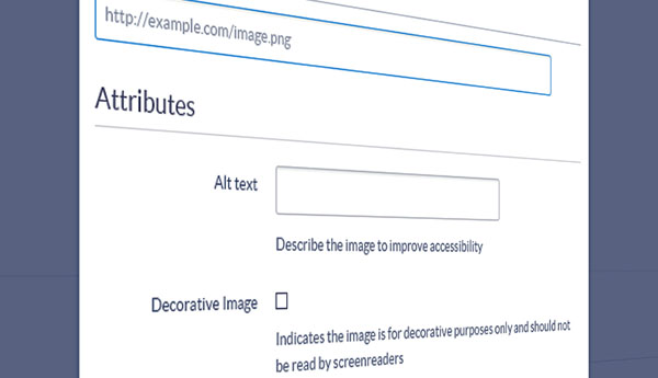
Assign alternative text descriptions to all images, graphics, and non-text content. Screen readers and other assistive technologies can read the descriptions and present the interpretation to visually impaired users. Screen reading software is able to identify images, so your description does not need to include text such as “image of…” or “graphic of…”
Provide captions and transcripts for video and audio
Add captions to videos for spoken dialogue, relevant sounds and music, and other important contextual elements that convey the video’s purpose. Captions should be synchronized so they appear at the same time the audio is available. Transcripts should also be included. Text transcripts are often preferred by proficient screen reader users since they can read at a faster rate than most people speak. A transcript allows a screen reader user to access the video’s information in less time than it would take to listen to the audio content.
Be sure to include transcripts for audio-only content that includes spoken dialogue.
Use meaningful link names
Give hyperlinks meaningful link text names. The link text should describe the content of the linked location, and should not consist of meaningless text such as “Click here.”
Punctuate
The correct use of punctuation enables voice synthesizers to output the correct cadences and generate more understandable speech.
Do not use color alone to convey information
Users with color deficiencies or other visual impairments must be able to perceive the information without relying on color.
Use enough contrast between text and background
Use text and background colors that provide enough contrast so that text stands out and is readable.
Don’t use unnecessarily small font sizes
Text should be easily readable without the need to zoom in.
Use headings correctly
Screen readers and other assistive technologies can navigate web pages by using headings. Using headings keeps your content well-organized and structured with levels of hierarchy, benefitting everyone. Always use headings in the proper order, Heading 1 (h1), Heading 2 (h2), Heading 3 (h3), etc., with h1 being the most important. Never skip a heading level, i.e. don’t use a Heading 1 and a Heading 3 without a Heading 2.
Use the list function to format lists
Format lists using your software’s or LMS’s list function. Bulleted (unordered) lists should be utilized for related items, and numbered (ordered) lists for sequential information. Using the list function helps assistive technology users in navigating and comprehending lists. This cannot be accomplished by instead, typing in bullets, spaces, or tabs to manually format lists.
Screen readers usually cannot recognize levels of indentation within an unordered list. If you are nesting or creating lists within lists, it is better to use an ordered list, and a different numbering system for each level of nested lists, similar to writing an outline. The following is an example of an accessible list with three levels:
Major League Baseball Teams
- National League
- East Division
- New York Mets
- Miami Marlins
- Washington Nationals
- Philadelphia Phillies
- Atlanta Braves
- Central Division
- Pittsburgh Pirates
- Cincinnati Reds
- Chicago Cubs
- Milwaukee Brewers
- St. Louis Cardinals
- West Division
- San Diego Padres
- Los Angeles Dodgers
- Colorado Rockies
- San Francisco Giants
- Arizona Diamondbacks
- East Division
When using tables, specify which cells are data and which are headers
Assistive technologies need to know the structure of a table in order to provide context to users. Your LMS should include a way to mark cells as data, row headers, or column headers. It’s also helpful to add a table caption. The caption functions as a heading, and identifies the overall topic of the table.
Link to accessible content
Remember that any content you link to should be accessible too.
Perform periodic accessibility checks
Making on online course accessible is not a one-time fix. Over time, changes occur in Learning Management Systems, browsers, assistive technology, and in the content of the course. These changes require ongoing reviews to maintain accessibility. Even if the course content has not changed, it is good practice to perform regular accessibility checks, such as before each new run of the course. In Part 2, I’ll talk about course content viewed outside of a browser, mainly Microsoft Office documents.


